

ADA Sign Sizing Rules and Guidelines – Why ADA Signs Can’t Always Be Small
Clients often want ADA signs to be as compact as possible. Unfortunately, ADA compliance requirements place real limits on how small a sign can be. Tactile letter height, Braille placement, edge clearance, character spacing, and overall message length all affect the final size.
Understanding these requirements early helps prevent redesigns, avoids installation issues, and keeps projects moving on schedule.
Why Size Isn’t Just a Design Choice
ADA-compliant signs are designed for people who read by touch as well as people with low vision. Because of that, they must follow specific rules for tactile lettering, Braille placement, spacing, and readability.
If those requirements are ignored, a sign may fail inspection, create usability issues for building occupants, or require costly rework after fabrication.
The reality is simple: many ADA signs cannot be made smaller without sacrificing compliance.
The Core Rules That Drive Size
1. Tactile Letter Height: 5/8″- 2″ (Measured on the Uppercase “I”)
5/8″ is the minimum height for raised tactile characters, while 2″ is the maximum.
Even when combined with visual text, tactile characters cannot exceed the 2″ limit. For longer room names or messages, the solution is usually a larger plaque or multiple text lines, not taller tactile lettering.
2. Clearances from Edges, Borders & Decorative Elements
Keep tactile characters and Braille at least 3/8″ away from any raised border, frame, or decorative feature.
Many fabricators also maintain approximately 3/8″ from the sign edge as a practical buffer. This helps prevent crowding and allows for manufacturing tolerances.
3. Braille Spacing & Placement
ADA signs require Grade 2 Braille with rounded, domed dots.
Braille must be positioned:
- Directly below the corresponding tactile text
- Approximately 3/8″–1/2″ below the tactile line
- At least 3/8″ from raised borders or decorative elements
Because Braille requires its own dedicated space, it often adds more height to the sign than many people expect.
4. Character & Line Spacing: The Hidden Size Drivers
Spacing requirements frequently have a greater impact on sign dimensions than letter height itself.
For tactile text:
- Maintain at least 1/8″ between characters when using rectangular stroke characters.
- For beveled or rounded strokes, maintain at least 1/16″ at the base and 1/8″ at the top.
- Use line spacing equal to 135%–170% of character height between tactile text lines.
When room names become longer, these spacing requirements quickly increase overall plaque size.
Bottom Line
Compliance requirements often prevent ADA signs from being “extra small.” The most successful projects align message length, layout, and mounting location with the space needed for tactile text and Braille from the beginning.
How Wide Should My ADA Sign Be?
When planning ADA room signs, the most common sizing question is: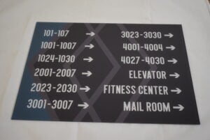
Will the wording actually fit?
The guideline below provides a practical way to estimate sign width based on a common configuration:
5/8″ tactile letters with Braille below.
Step 1: Count Your Letters (With a Few Adjustments)
Not every letter occupies the same amount of space.
Use this quick sizing method:
- Count each standard letter as 1
- Count M and W as 2
- Count I as 0.5
The total becomes your adjusted letter count, which you can compare against the width recommendations below.
Step 2: Use the Width Guide
The following recommendations assume:
- 5/8″ tactile characters
- Standard spacing
- Grade 2 Braille below the text
- A layout designed for readability and compliance
| Sign Width | Fits Approximately |
|---|---|
| 6.0″ Wide | Up to 7 letters |
| 6.5″ Wide | Up to 8 letters |
| 7.0″ Wide | Up to 9 letters |
| 8.0″ Wide | Up to 11 letters |
These are general guidelines for typical all-capital tactile text. Words containing multiple M’s or W’s, or layouts requiring two lines, may require additional width or height.
Step 3: Check Your Height
For one line of tactile text with Braille below, plan for approximately:
2.5″–4.0″ tall
For two-line layouts, additional height is required to accommodate:
- Extra tactile text
- Additional Braille
- ADA-compliant line spacing
Quick Examples
“EXIT”
- Letter count: 4
- Recommended size: approximately 6″ × 4″
- One line with Braille below
“MECHANICAL”
- Letter count: 10 (including the wider “M”)
- Recommended size: 8″ × 4″ minimum for a single-line layout
If the available wall space is narrower than 8″, consider an approved abbreviation such as:
- MECH
- MECH RM
Any abbreviation should align with the facility’s room-naming standards and remain clear to occupants. The Braille should match the tactile abbreviation.
“JANITORIAL CLOSET”
- Longer two-word room name
- Recommended size: approximately 10″ wide on a single line
If sufficient width is not available, a two-line layout is often the cleaner and more practical solution.
Planning Tips for Project Teams
Lock Copy Early
Every additional word affects the required sign size. Finalizing room names before the layout stage reduces revisions and approval delays.
Group Information Strategically
When messages become too long, consider:
- Approved abbreviations
- Separating room identification from directional information
- Using wayfinding signs for supplemental details
Consider Mounting Conditions
Door frames, wall returns, trim details, and tight mounting surfaces can limit available sign size. Identifying those constraints early helps avoid late-stage changes.
Standardize Where Possible
Using consistent sign sizes across a facility improves appearance, simplifies installation, and reduces project surprises.
Quick Note on Visual-Only Signs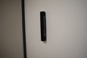
Character height requirements for visual-only signs are based on viewing distance and mounting conditions.
Even when tactile requirements do not apply, readability still drives many sizing decisions. That’s another reason extremely small signs are often impractical.
Frequently Asked Questions
What is the minimum tactile letter height for an ADA sign?
Tactile characters must be at least 5/8″ high, measured using the uppercase “I.”
Can tactile letters be larger than 2 inches?
No. ADA tactile characters have a maximum permitted height of 2 inches.
How far below tactile text should Braille be placed?
Braille is typically positioned 3/8″–1/2″ below the tactile text line and must correspond directly to that text.
Can abbreviations be used on ADA signs?
Yes, provided the abbreviation is approved, clearly understood, consistent with the facility’s naming standards, and reflected in the Braille translation.
How Erie Custom Signs Can Help
Every project has unique room names, mounting conditions, and space limitations. We review each sign for ADA compliance, readability, and fabrication practicality before production.
If something will not fit, we’ll identify it early and provide clear options, whether that means an approved abbreviation, a larger plaque, or a cleaner multi-line layout.
Ready to Size Your Signs?
If you’re planning an ADA signage project and want help determining the right sign sizes before fabrication begins, our team is happy to review your layouts and requirements.
Get in touch: https://eriecustomsigns.com/contact/